Need to work with spatial data using R? rspatialdata is a collection of data sources and tutorials for doing just that. Check it out at https://rspatialdata.github.io/index.html.
Category: R
A Succinct Guide to R
Steve Haroz has just published (30 September 2021) A Succinct Guide to R available at http://r-guide.steveharoz.com/. It is a short introduction to the R language, pointing out some of R’s peculiarities often with humor. I recommend it to all who are just learning R.
Using Named Colors with ggplot2
Consider these two plots:
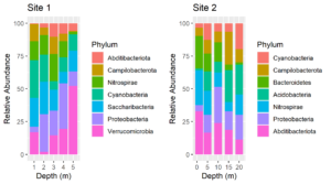
The colors assigned to the phyla are not the same in the two plots. We cannot make them so simply by faceting because there are unique phyla at each site and the sites were sampled at different depths. In fact, they were plotted using different tibbles. Still, it would be much easier to interpret the plots if the same colors were assigned to the phyla that are common between the plots. We can do this by using a palette of named colors.
First, get a vector of the union of unique phyla for each plot and determine its length. The plots were made from two tibbles, df1 and df2.
unique.phyla <- union(unique(df1$Phylum), unique(df2$Phylum))length(unique.phyla)[1] 9
So while there are only 7 phyla in each plot, there are a total of 9 in the two plots. Next, get a vector of 9 colors and name the colors with the names of the phyla.
my.colors <- RColorBrewer::brewer.pal(n = length(unique.phyla),name = "Paired")
names(my.colors) <- unique.phyla
my.colors
Cyanobacteria  Campilobacterota  Nitrospirae Proteobacteria
"#A6CEE3"      "#1F78B4"         "#B2DF8A"       "#33A02C"
Abditibacteriota Saccharibacteria Verrucomicrobia Acidobacteria
"#FB9A99"        "#E31A1C"        "#FDBF6F"       "#FF7F00"
Bacteroidetes
"#CAB2D6"
Replot, using the named palette for the fill colors. The plots above were made using the same code as below except that the scale_fill_manual lines were omitted.
plt1 <- ggplot(df1, aes(x=Depth, y=value, fill = Phylum)) +geom_col() +ylab("Relative Abundance") +scale_fill_manual(values = my.colors, aesthetics = "fill") +xlab("Depth (m)") +ggtitle("Site 1")plt2 <- ggplot(df2, aes(x=Depth, y=value, fill = Phylum)) +geom_col() +scale_fill_manual(values = my.colors, aesthetics = "fill") +ylab("Relative Abundance") +xlab("Depth (m)") +gtitle("Site 2")cowplot::plot_grid(plt1, plt2)
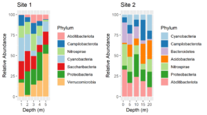
Voila! Now the color assignments are consistent between phyla. This approach can be generalized to solve the same problem with other types of plots.
Import DADA2 ASV Tables into phyloseq
ASV Tables Created in R
ASV tables created using the Bioconductor/R version of DADA2 are matrix files with samples as rows and taxa as columns. The taxa names are the sequences themselves. Because these matrices can be quite large they are most conveniently saved as compressed rds files. Read these files into R and create an experiment level phyloseq object containing an OTU or ASV table and representative sequences with the following R script: Continue reading “Import DADA2 ASV Tables into phyloseq”
Compact Letter Displays
Compact letter displays (CLDs) are letters that show which treatment groups are not significantly different by some statistical test. It is often desirable to include CLDs on graphs. Here I show how to add them to a box plot created with ggplot2. Continue reading “Compact Letter Displays”
Get ggplot plot panel limits
I have added a new function (get_plot_limits) to my package QsRutils. It extracts the minimum and maximum X and Y values for a ggplot panel. This is useful in formatting ggplots. For example, you may wish to expand the panel to avoid text running out of the panel, or nudge text relative to some point. For an example, see my post on adding compact letter displays to box plots created with ggplot2.
Rooting Unifrac Trees in phyloseq Objects
The method of rooting trees described in the post “Unifrac and Tree Roots” is now included in QsRutils beginning with version 0.3.2 as function root_phyloseq_tree. Given a phyloseq object with an unrooted tree, it returns the same type of phyloseq object with the tree rooted by the longest terminal branch.
Unifrac and Tree Roots
Unifrac distances have the attraction of including phylogenetic relatedness, based on a tree of the representative sequences, in the distances among samples calculated from an OTU table. FastTree is the usual method of choice in generating the tree, although USEARCH also provides a method. Both methods calculate unrooted trees, and calculation of Unifrac distances requires a rooted tree. The problem arises in how to best root the tree. I found a discussion of the problem on the phyloseq GitHub site (https://github.com/joey711/phyloseq/issues/597). Continue reading “Unifrac and Tree Roots”
Update R in Ubuntu
If you installed R from the Ubuntu repository with
sudo apt-get install r-baseyou most likely got an out of date version. In February 2018, that method still gave me R version 3.2.3 (2015-12-10). To get the latest versions of R and its packages, you need to add CRAN to the apt-get repositories. Do this with the code below. Enter one line at a time. Cut and paste to prevent errors. Continue reading “Update R in Ubuntu”
Rotatable 3D Plots
The R package vegan includes the function ordiplot for making ordination plots using R’s base graphics. Additionally vegan provides several functions for enhancing the plots with spiders, hulls, and ellipses. It is even possible to overlay an ordination plot with a cluster diagram. (See my package ggordiplots on GitHub for making the same kinds of plots with ggplot graphics.) Vegan’s functions for adding these layers begin with “ordi”: ordispider, ordihull, ordiellipse, ordicluster. Earlier this year I discovered the package vegan3d. It makes use of rgl graphics which means that the plots it generates can be scaled and rotated with the mouse. This is not just fun – it allows you to see how well separated treatment groups are in the ordination space.