Blog

RDP Classifier Updated (Again!)

In August 2023 the RDP Classifier was updated to version 2.14 using bacterial and archaeal training set No. 19. This training set includes 600 new genera and 2,500 new species over the previous version released in 2020, as well as numerous taxonomic rearrangements and adoption of new phyla names as proposed in Oren and Garrity (2021).  For further details, see the release notes.

You may download the updated classifier from Sourceforge. In addition, there are species rank and QIIME2 formatted versions of the training data.

The web version of the RDP Classifier is no longer available.

Reference

Oren, A. and G.M. Garrity. 2021. Valid publication of the names of forty-two phyla of prokaryotes. Int J Syst Evol Microbiol. 2021 Oct;71(10). doi: 10.1099/ijsem.0.005056. PMID: 34694987.

Scanning FastQC Results for Many Files

The first step in working with sequencing data should always be evaluating its quality. This can be done with the FastQC program which generates html formatted reports you can read in your browser, but if you have hundreds of paired-read files, do you really want to examine them all one by one? I know I don’t, and so up until now I have been examining a subset, say 10 or 12 of the files. But I recently discovered an R package capable of summarizing the results, and using tidyverse functions you can filter the summary to show only samples with potential problems.

The name of the package is, unsurprisingly perhaps, fastqcr and it can be installed from the CRAN repository using the “Packages” tab in RStudio or  by entering the following command in the R terminal:

install.packages("fastqcr")

See the GitHub page https://github.com/kassambara/fastqcr for full instructions on the use of the package.

Not all of the reports are pertinent for processing 16S rRNA gene amplicon data, so I have been using something like the following to examine such data:

library(fastqcr)
library(dplyr)
rpt <- qc_aggregate(qc.dir = "fastqc/")
rpt |> print(n=11)

Where my FastQC results are in the directory fastqc/ under my working directory. This produces something like:

From this we can see the names of the individual reports (modules) per file and that the sequences should all be 301 bp in length. With this information we can filter rpt to show which samples have potential problems regarding overall sequence quality and the presence of uncalled bases or adapter sequences.

rpt |>
  dplyr::filter(module %in% c('Per base sequence quality',
                              'Per base N content',
                              'Adapter Content'),
               status != 'PASS' | `seq.length` != 301) |>
  print(n=Inf)

For this example data, we get the following:

If there were no potential problems for the items, you would get an empty result.

speedyseq – Enhanced phyloseq Functions

I recently discovered the R package speedyseq by Michael McLaren. It includes much faster implementations of some phyloseq functions : tax_glom(), tip_glom(), and the plotting functions that make use of psmelt()plot_bar(), plot_heatmap(), and plot_tree(). There are also lots of convenience functions including ones for extracting the otu, sample data and taxonomy tables, and even the entire phyloseq object, as tibbles.

For further information, check out the Readme file on GitHub at https://github.com/mikemc/speedyseq.

speedyseq can be installed in R using either of the following methods:

if (!requireNamespace("remotes", quietly = TRUE))
    install.packages("remotes")
remotes::install_github("mikemc/speedyseq")

Or:

if (!requireNamespace("devtools", quietly =TRUE))
    install.packages("devtools")
devtools::install_github("mikemc/speedyseq"


Using Named Colors with ggplot2

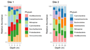
Consider these two plots:

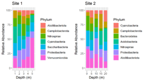
The colors assigned to the phyla are not the same in the two plots. We cannot make them so simply by faceting because there are unique phyla at each site and the sites were sampled at different depths.  In fact, they were plotted using different tibbles. Still, it would be much easier to interpret the plots if the same colors were assigned to the phyla that are common between the plots. We can do this by using a palette of named colors.

First, get a vector of the union of unique phyla for each plot and determine its length. The plots were made from two tibbles, df1 and df2.

unique.phyla <- union(unique(df1$Phylum), unique(df2$Phylum))
length(unique.phyla)
[1] 9

So while there are only 7 phyla in each plot, there are a total of 9 in the two plots. Next, get a vector of 9 colors and name the colors with the names of the phyla.

my.colors <- RColorBrewer::brewer.pal(n = length(unique.phyla),name = "Paired")
names(my.colors) <- unique.phyla
my.colors
Cyanobacteria  Campilobacterota  Nitrospirae Proteobacteria
"#A6CEE3"      "#1F78B4"         "#B2DF8A"       "#33A02C"
Abditibacteriota Saccharibacteria Verrucomicrobia Acidobacteria
"#FB9A99"        "#E31A1C"        "#FDBF6F"       "#FF7F00"
Bacteroidetes
"#CAB2D6"

Replot, using the named palette for the fill colors. The plots above were made using the same code as below except that the scale_fill_manual lines were omitted.

plt1 <- ggplot(df1, aes(x=Depth, y=value, fill = Phylum)) +
    geom_col() +
    ylab("Relative Abundance") +
   scale_fill_manual(values = my.colors, aesthetics = "fill") +
    xlab("Depth (m)") +
    ggtitle("Site 1")
plt2 <- ggplot(df2, aes(x=Depth, y=value, fill = Phylum)) +
    geom_col() +
    scale_fill_manual(values = my.colors, aesthetics = "fill") +
    ylab("Relative Abundance") + xlab("Depth (m)") +
    gtitle("Site 2")

cowplot::plot_grid(plt1, plt2)

Voila! Now the color assignments are consistent between phyla. This approach can be generalized to solve the same problem with other types of plots.


RDP Classifier Updated

The RDP Classifier was updated to version 2.13 and released 30 July 2020 on SourceForge (https://sourceforge.net/projects/rdp-classifier/). The update is based on  bacterial and archaeal training set No.18 with over 800 new genera and significant rearrangements of several phyla and genera based on the latest genome analyses.  For detailed explanations of these revisions, please see the release notes.

As in earlier editions, databases are also included for classification of  fungal ITS sequences by UNITE and Warcup taxonomies and for  classification of fungal 28S rRNA gene sequences.

Web Version

The web version of the classifier has been updated to use training set No. 18. The taxonomy browser has also been updated to comply with the new training set.

Installing as a stand-alone application

Written in Java, the RDP Classifier may be installed and run in Windows, Mac OS, Linux, Unix and Solaris environments.

  1. Test if the Java Runtime Environment (JRE) is already installed by opening a terminal and entering:
 java -version
  1. If necessary, install JRE  downloaded from here. While Oracle now charges for the development version of Java (JDK), JRE is still free.
  2. Download RDP Classifier version 2.13 from here and extract the compressed file.

The classifier.jar file will be in sub-directory dist.

Installing as part of RDPTools

The only way to update the classifier in RDPTools is to remove and re-install RDPTools following the instructions here. Updating RDPTools will not work because the new databases are not part of the code but are downloaded during RDPTools installation.

Updating the QIIME2 version of the RDP Classifier

Reference sequences and corresponding taxonomy file for re-training the RDP Classifier included in QIIME2 can be downloaded by clicking here. See this page for how to re-train the classifier.

Import DADA2 ASV Tables into phyloseq

ASV Tables Created in R

ASV tables created using the Bioconductor/R version of DADA2 are matrix files with samples as rows and taxa as columns. The taxa names are the sequences themselves. Because these matrices can be quite large they are most conveniently saved as compressed rds files. Read these files into R and create an experiment level phyloseq object containing an OTU or ASV table and representative sequences with the following R script: Continue reading “Import DADA2 ASV Tables into phyloseq”

Get ggplot plot panel limits

I have added a new function (get_plot_limits) to my package QsRutils.  It extracts the minimum and maximum X and Y values for a ggplot panel. This is useful in formatting ggplots. For example, you may wish to expand the panel to avoid text running out of the panel, or nudge text relative to some point. For an example, see my post on adding compact letter displays to box plots created with ggplot2.